
Friday, 30 August 2013
Thursday, 29 August 2013
Week 5
Presentation boards
3 examples
 |
| http://www.alexhogrefe.com/storage/thumbnails/3906413-18449159-thumbnail.jpg?__SQUARESPACE_CACHEVERSION=1338240711968 |
This poster uses a great sense of colour, minimal use of colour creates a simplistic and elegant look of the prsentation. The overlay of the images used shows different information of the building which is easy to look at and you would know what it is with minimal text used.
 |
| http://themogbloggers.files.wordpress.com/2008/03/layout-a.jpg |
The elevations shown is a concept I like to use to portray the envelope of the building, and the perspective model with annotations is a great idea with the information.
 |
| http://cdn.archinect.net/images/1200x/ub/ub3ahggbbetxwmlf.jpg I like the use of colours and the composition of the layers throughout the poster and how the information is put through. |
Thursday, 22 August 2013
Week 4
Studio Exercise 3
Stage 1


More detail images

 |
| http://moreaedesign.files.wordpress.com/2010/09/scan00051.jpg?w=700 |


Stage 2
( Will be posted as soon as possible due to no access to photoshop or other photo editing program. )

Here there is two stages within the complex facing opposite directions and stacked on top of each other, which I have incorporated in my design through the difference in height levels producing more space.
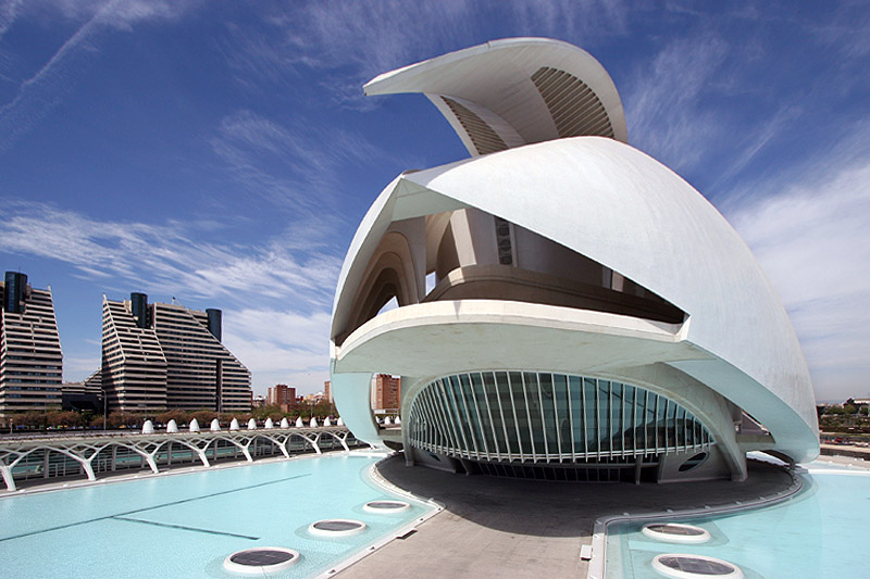
All images in this post: http://www.calatrava.com/#/Selected%20works/Architecture/Valencia%201?mode=english
Friday, 16 August 2013
Week 3
SKETCHUP MODELS
Composition 1#

The 3 Primitives used is a Rectangle, Sphere, and Pyramid.
Inspired by Santiago Calatrava and his use of the human forms.
My design forms the shoulder part of the human body the sphere represents the joinery of the arm to the shoulder.
Composition 2#

This shows what I need to implement into to the object creating a living space.
Week 2
Folded Papers
1#


2#


These folded papers was inspired by Santiago and his use of line and shapes with white.
Thursday, 8 August 2013
Week 1
Free-hand perspective drawings
First weeks task was to free hand sketch a perspective of a building. There was limited information provided within each of the three groups in the class, and we was provided with the elevations and sections only of the building. For the task I found that we had the easiest information to sketch the envelope of the building.


Santiago Calatrava
Santiago Calatrava is a Spanish Architect, a structural engineer and a sculptor primarily in Switzerland. The Valencia complex is a very interesting building Santiago designs are described as exoskeleton look, smooth curves and lines, simple yet complex and functional all with no budget.
Its interesting to see the use of the colour white which Santiago use in most of his designs, thus creating a simplistic feeling about design. The structural engineer background Santiago has put a lot towards his designs.
 |
| http://www.worldarchitecturenews.com/news_images/1000%20Calatrava.jpg |
 |
| http://blog.kmpfurniture.com/wp-content/uploads/2013/03/S1.jpg |
 |
| http://www.minimalisti.com/wp-content/uploads/2012/01/how-to-architect-calatrava3.jpg |
 |
| http://www.archdaily.com/326165/calatrava-criticized-for-valencia-complex/ |
Subscribe to:
Comments (Atom)